STUDIO MYO
Multimedia design and development studio.
CONTEXT
IDENTITY
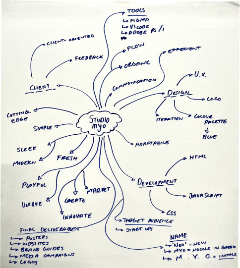
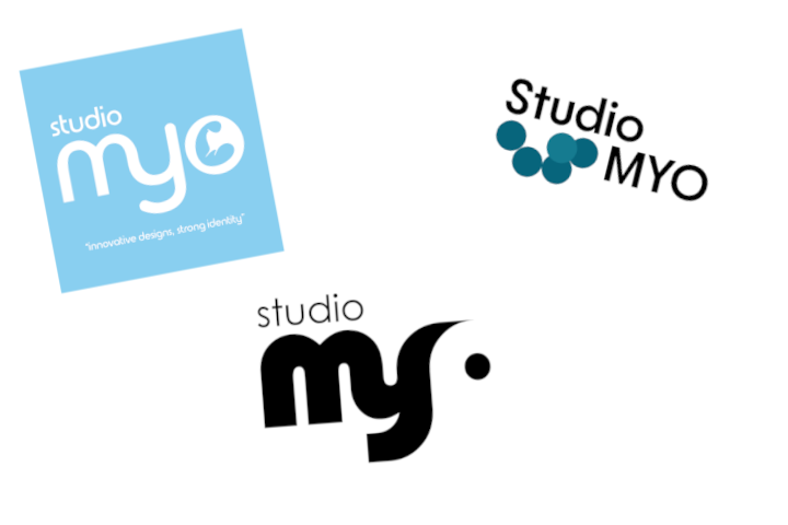
Studio Myo is the team I worked with throughout the semester. The name "Myo" came from trying to make a word out of our initials at the time (MYYO, one Y taken out for simplicity). While not the most original idea, we hoped to reverse engineer a meaning from it from which we could base an identity for ourselves.
From there we made the following observations:
- "Myo" is a word of Greek origin, used to relate to muscles.
- "Myo" can be read similarly to "Neo", which relates to something new.
- Adding "Studio" to the front reads as "Studio Myo", which has the same pronunciation as "Studio Mio", meaning "My Studio" in Spanish.
COLOR
We chose blue as our primary color, as it communicated innovation with a safe and reliable undertone.
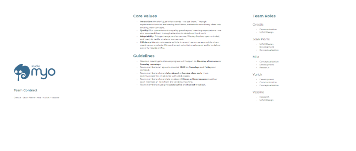
TEAM CONTRACT
In the meantime, we created a Team Contract with our core values, guidelines, roles and attributes. The core values we chose were:
- Innovation, to always strive for something new. This ties into the Myo/Neo similarity.
- Quality, to make sure every detail is just right.
- Adaptability, because we're willing to change with the client.
- Efficiency, to get things done quickly without sacrificing quality.
We also decided that our tone of voice should be direct yet relatable, as we chose to target startups looking to innovate. The directness reflected our desire to innovate, while the relatability relfected the youthfulness in new startups.
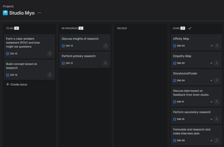
PLANNING
We initially made a Trello board to keep track of tasks and their deadlines. A teacher suggested we use Jira instead as it is more common in professional spaces, so we moved our tasks there instead. We would later apply a Scrum-based planning with sprints and check-in's to ensure tasks were organized and completed on time.
WORDMARK PROTOTYPE
INITIAL DESIGN
As we all began making logo design ideas, I created a wordmark logo using Adobe Illustrator. I started out with the plain text "myo" and made a few edits, such as conncecting the stems of the "m" and the "y". I thought the flexible stems relate to our core value of Adaptability.

NEGATIVE SPACE
I couldn't figure out what to do with the "o", as it felt out of place yet hard to incorporate. I got the idea to make use of negative space, leading to a very fluid look.

FEEDBACK AND ITERATION
While I didn't initially like the logo, my teammates and teachers seemed to really like it. One of my teachers suggested I shorten the tail of the "y" to bring symmetry to the logo. So I did just that, making the logo feel more balanced overall.

TEACHER FEEDBACK
My teacher remarked that while the logo looked nice, it didn't immediately communicate anything to him about the studio. He also noted that the "o" reminded him of toilet paper, which was not the intended idea.
DEMO FEEDBACK
One student said that our logos weren't communicating strength despite us mentioning muscle as a core idea, remarking that they looked more safe or baby-like. People also saw the toilet paper in the logo among other things, such as an elephant.
REFLECTION
As a result of not having a solid foundation for our team's identity, the logo I made didn't make much sense. While it looks nice, its lack of meaning gave way to multiple misinterpretations, as there was never a solid idea behind it in the first place. Going forward I'll think more about what I want the logo to communicate in advance.

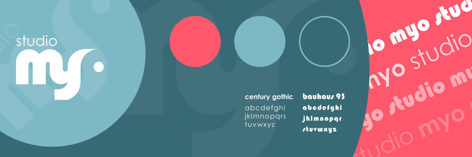
STYLESCAPE
I made a stylescape using Figma to test out some fonts and colors, getting a feel for what the logo would look like in a practical setting. I chose the following colors:
- Blue, to represent innovation, with a grounded dark shade.
- Light Blue, to give a safer, more reliable tone.
- Pink, to represent the color of muscle, as well as acting as a fun contrast to the blue.
I chose the font Bauhaus 95 as it was used in the wordmark, and Century Gothic for its simplicity and readability.
LOGO
CONTEXT
While my wordmark design wasn't used, it did inspire my teammates to try similar designs. My teammate Yassine made one with a similar "m-y" connection but with a thinner font. As we were adivsed to make the logo communicate our core values or themes, Yassine made a logo with a muscle in the "o".
While it looked nice, our teachers remarked that it seemed a band-aid fix rather than a proper solution. They suggested we look to animals or things that reflect our core values. We decided to completely scrap the muscle theme and focus on our value of Adaptability.
INITIAL DESIGN
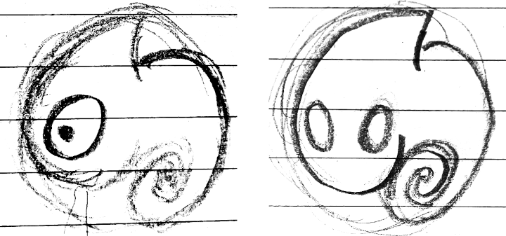
When thinking of an animal that could fit our core value of Adaptability, I thought of a Chameleon, who adapts to its surroundings in nature. I made a few sketches of a possible Chameleon logo, with the following goals in mind:
- To hightlight the most recognizable parts of the Chameleon (the head and tail).
- To fit the logo into a circle.
FEEDBACK
One of my teachers provided the following feedback:
- The two eyes look much better than just one as it gives the logo more depth.
- If Adaptability is one of our core values, then he Chameleon should not be confined to a circle.
- He suggested I try making the tail stick out of the circle.
I proposed adding the Chameleon's tongue and making it literally stick out. While he didn't find it to be very appealing, he suggested I give it a shot regardless.
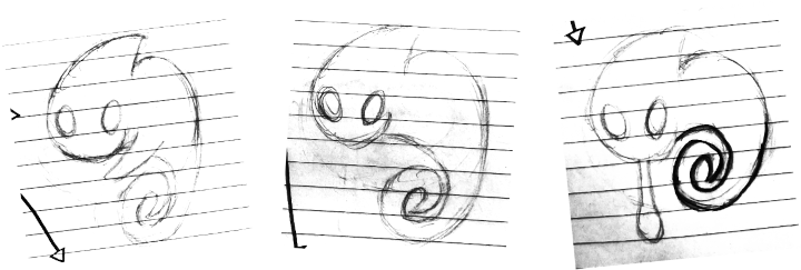
FIRST ITERATION
I made three new sketches:
- One with its tail out of the circle, with an added arm as I felt something was needed to fill the space in between.
- One with its tail out again, without the arm just to see what it'd look like.
- One with its tail still confined within the circle, instead sticking out its tongue.
FEEDBACK
My team found the one with the tongue to be the best, as it highlights a defining trait of the Chameleon and accomplishes the goal conveying Adaptability without compromising the look of the logo.
My teachers found the logo to look nice, though they suggested I give the Chameleon pupils, as it currently appeared similar to a ghost.
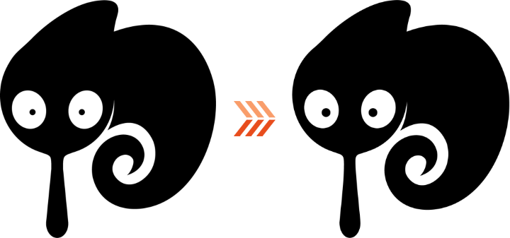
SECOND ITERATION
Based on the feedback I received, I made a first draft of the Chameleon in Adobe Illustrator, going with the tongue design and adding pupils.
DEMO FEEDBACK
Once again, a slew of logo misreadings were expressed by the other students, such as:
- A popsicle
- A ghost (still)
- An elephant
Some suggested changing the color of the tongue, as it could also be misread as:
- Drool
- Snot
We were also told that the small colored pupils of the logo were more creepy than friendly.

FINAL ITERATION
Based on the feedback from the demo, I made a refined version of the logo where the eyes are bigger and closer together. This gave the chameleon a way friendlier appearance, which is especially noticable when comparing it to the original.
I chose to disregard the any feedback relating to misreadings as the team and I felt they began to veer into nitpick territory.
FEEDBACK AND VALIDATION
My team found the logo to work just fine, and that making any more changes was unnecessary. Teachers that we showed also found the logo to be good, saying there was so much we could do to avoid misreadings.
REFLECTION
I'm really satisfied with how the logo turned out, and working it out in Illustrator was challenging but fun. I notice however that that my logos get misread quite frequently.
The only I can imagine getting around this would be through extensive user-testing, and while it helps, there's only so much you can do. Logos get misread all the time! I feel that if it communicates the core values well and looks cool, that's really what matters most.
