minor health innovation
context
My team was tasked with creating a brand guide to bring more attention to the Minor Health Innovation study at Fontys.
target audience
The client was looking to attract students of both ICT and Health related studies who were in search of a minor.
planning
team charter
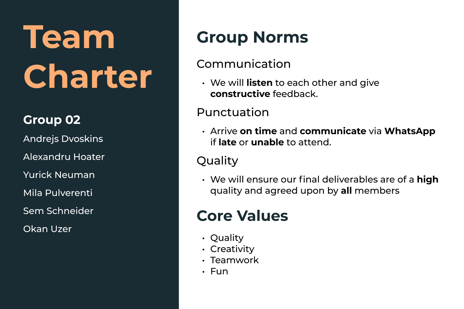
I created a Team Charter for my team to establish our group norms and core values.
trello board
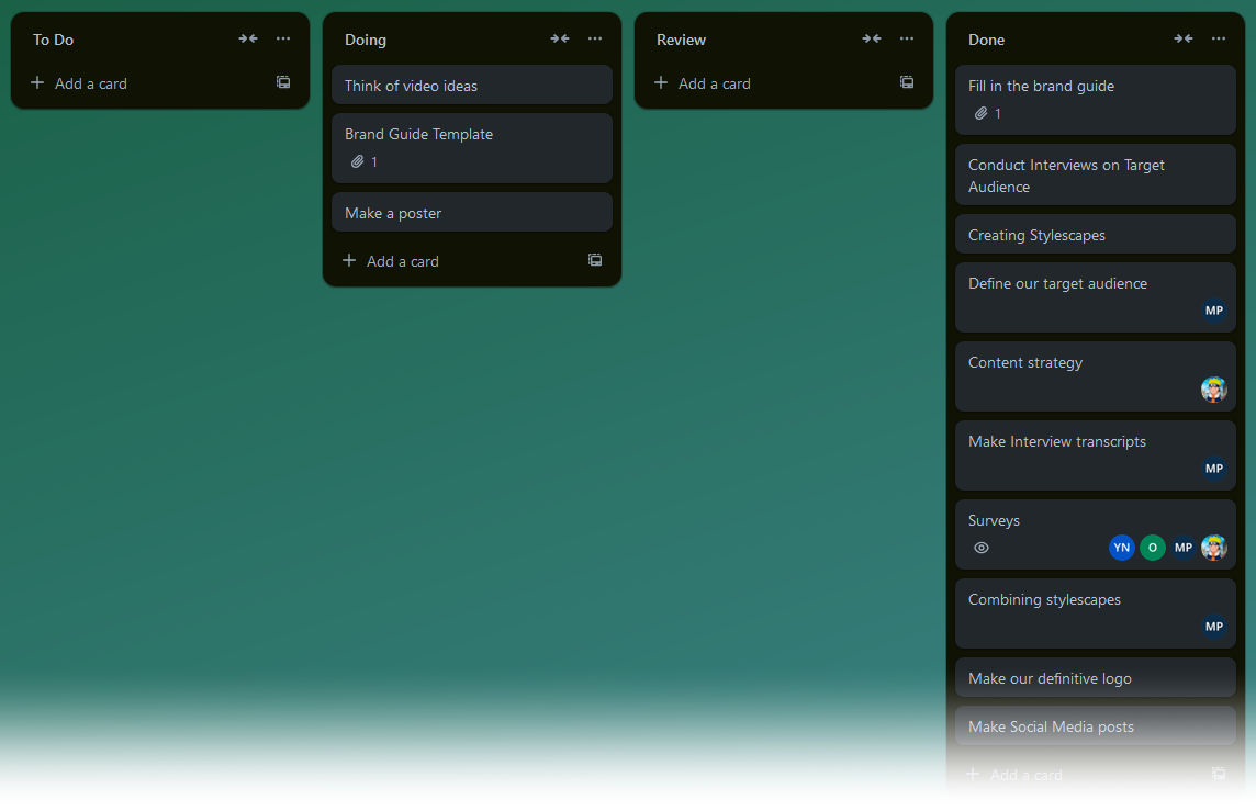
A Trello board was used for this project to keep track of tasks and split them across teammates. This board did not specify any deadlines, which is something we kept in mind for the next project.
stylescape
I created a stylescape to provide the client with a possible brand identity concept.
I made the stylescape based on feedback my other teammates received on their stylescapes. The client remarked that though they liked the primarily blue color palettes, they were missing the purple color associated with Fontys.
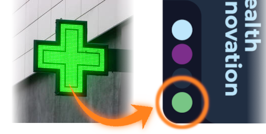
I managed to incorporate purple by using it as a tint for a stock image. I also used green as an extra accent color due to its use is various health related imagery.

feedback
I presented my stylesheet during our Sprint Demo, and while the client liked my stylesheet and its color palette, they still preferred the blue color palette of other stylesheets that we showed.
logo
initial design
I created a logo for my stylescape, using Adobe Illustrator for the first time. My goal was to fuse a gear with a cross, symbolizing technology and health respectively.
Starting with a gear, I tried things like making one side into a cross, but it looked a little rough.

cleanup
Splitting off the middle of the cross cleaned things up, but made it harder to tell what the shapes were.
feedback
My teammate Mila liked how clean it looked, but suggested I try different colors to differentiate the cross from the gear.

iteration
I did a few variations of the logo with color, trying out different ways of making the shapes more obvious.
second feedback
My teammates found these new designs to be too cluttered, preferring the previous design's cleaner look. Mila suggested rounding the corners of one shape to differentiate it from the other

second iteration
I went back to the previous design and rounded the corners of the cross as a last-ditch effort to distinguish the two shapes.
final feedback
One of my teachers said that while the design itself was clean, they couldn't tell it was a gear or a cross until I mentioned it (as expected). In the end my team and I went with another logo.

color palette
During our sprint demo, we presented the client with various color palettes alongside results from a survey Mila created, where the palettes were auditioned against keywords to see which one best evoked our core values.
The results looked to be in favor of the more teal color palette, but the client still preferred the more blue look as it was closer to the Fontys purple.

compromise
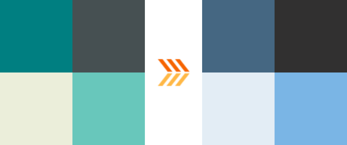
We chose to compromise by keeping the general tones of the teal palette, while shifting the colors slightly more towards blue. This way the colors can still evoke our core values while also appealing slightly to the Fontys purple as the client wished.
adobe color
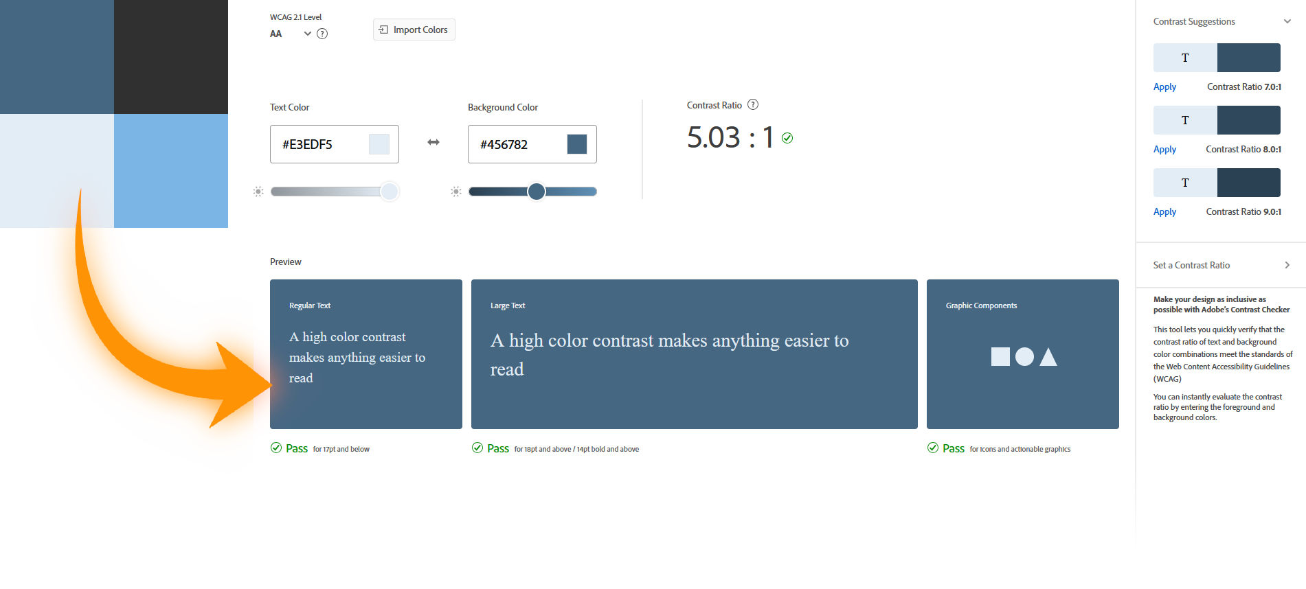
I used Adobe Color's Accessibility Tools to further optimize the color palette we chose, ensuring good text contrast and readability.
brand guide
template
Mila and I were tasked with compiling our work and creating the brand guide. We used a Figma template that our teammate Sem provided, along with the Fontys Brand Guide as a reference for what should be included and how things should be laid out in our brand guide.

layout and design
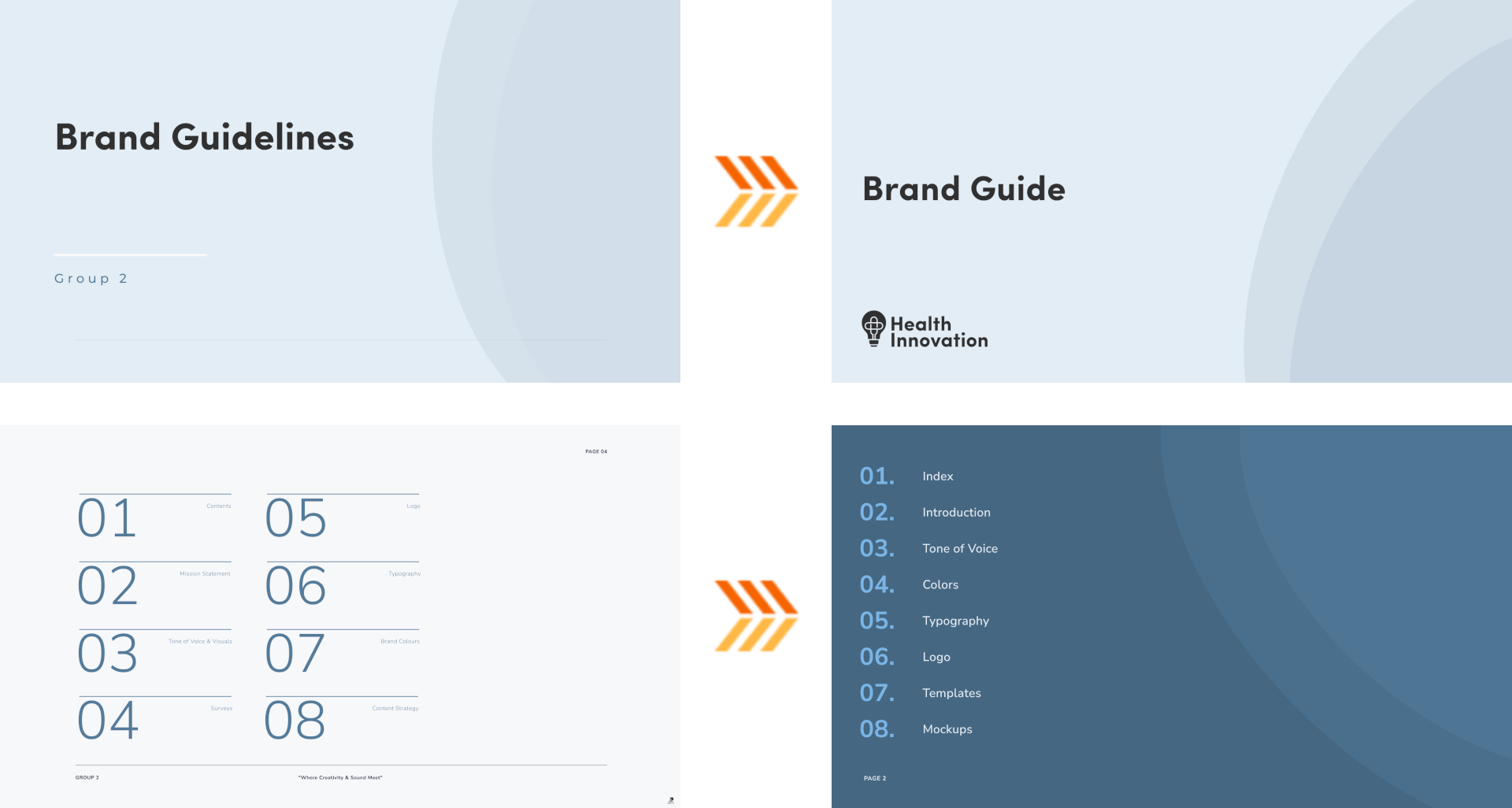
When designing the actual brand guide, I didn't want to just reuse the template's design. Mila still really liked it however, so I created a new one that resembled the original, while deviating just enough to fit the brand identity we had in mind.
aspect ratio
I initially wanted to make the aspect ratio of the document identical to that of an A4 paper for printing. Mila suggested against this, saying it didn't look as good and wasn't necessary as the document would be viewed on a computer screen.
logo dos and don'ts
Alongside creating the layout, I also created content for the Logo section of the document, showcasing examples of dos and don'ts for the logo assets.

feedback
We asked a teacher for thoughts on keeping the chapter cover pages present on the original template, as Mila liked them but I found them redundant. The teacher found them to be a good addition as they helped further unify the brand guide.
implementation
I adapted the cover pages into the brand guide, adding the logo to further drive the style.

video
context
During the course of the project, my team established that an increased social media presence would help bring attention to the minor, as the target audience is very active on social media. And so my teammates Andrejs, Mila and I put together a video as an example of what the client could post on platforms like TikTok or Instagram Reels.
creation
Mila filmed clips of Andrejs, while Andrejs himself made a base edit of alongside music. I animated an intro that was inline with the aesthetics presented in the brand guide, as well as editing in extra footage that Andrejs filmed later on and tightening things up.
feedback
The client liked the video and appreciated that the video could carry a fun tone while still being informative about the minor.
reflection
stylescape
I'd never made a stylescape before, and while the one I made was simple, I felt it was effective in communicating its style. I do wish I'd gotten more feedback on it, though I did put it together rather quickly based on already existing feedback we got from the client. Still, some extra iteration would've been better.
research
I also wish I did more research. Surveys and interviews on my end would have been very beneficial in validating my design choices. This is something I made sure to focus on in future projects.
logo
Working with Illustrator went very smoothly and I got accustomed to it easily. Making the logo itself taught me that while an idea might sound good on paper, it won't always execute well and it's better to move onto another.
brand guide
The brand guide was very fun to work and collaborate on. I wish I was more stern about maintaining the A4 sizing, as it turned out we were encouraged to print the brand guide. 16:9 would not have looked as good on an A4 paper, and in my opinion the A4 sizing feels more official.
video
The video was also fun to collaborate on, as I've never actually co-edited a video with someone else before. It was a positive experience for me and I'd like to do it again in the future.