hue hazard
context
For Project X, I chose to make a website for my music project Hue Hazard, which acts as the soundtrack to a fictional cartoon show that would have aired in the mid to late 2000s.
target audience
I wanted to target listeners of alternative music with a primary focus on teenagers to young adults aged 16-26. I feel that this age rannge experienced a critical portion of the 2000s and late 90s nostalgia that may help the project's music and aesthetics resonate with them more.
goal
My main goal with this project is to get the intended aesthetics across, while also communicating two product simultaneously (both an album and a narrative).
planning
project plan
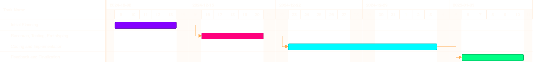
I made a project plan to define my research questions, methodology and project scope. I also made a gantt chart to plot out my project's phasing and ensure my products were finished on time.
feedback
My coach for the project liked the idea, but was not happy with the large scope of the project. He also thought that work on the project should pause during the holidays, as doing so could otherwise lead to burnout.
iteration
I updated my project plan and phasing to reflect this feedback, reducing the scope to simply user testing and prototyping, with any coding being completely scrapped. As a result, any work during the holidays was no longer necessary.
I still did some work during my free time in the holidays, but it was very little.

aesthetic research
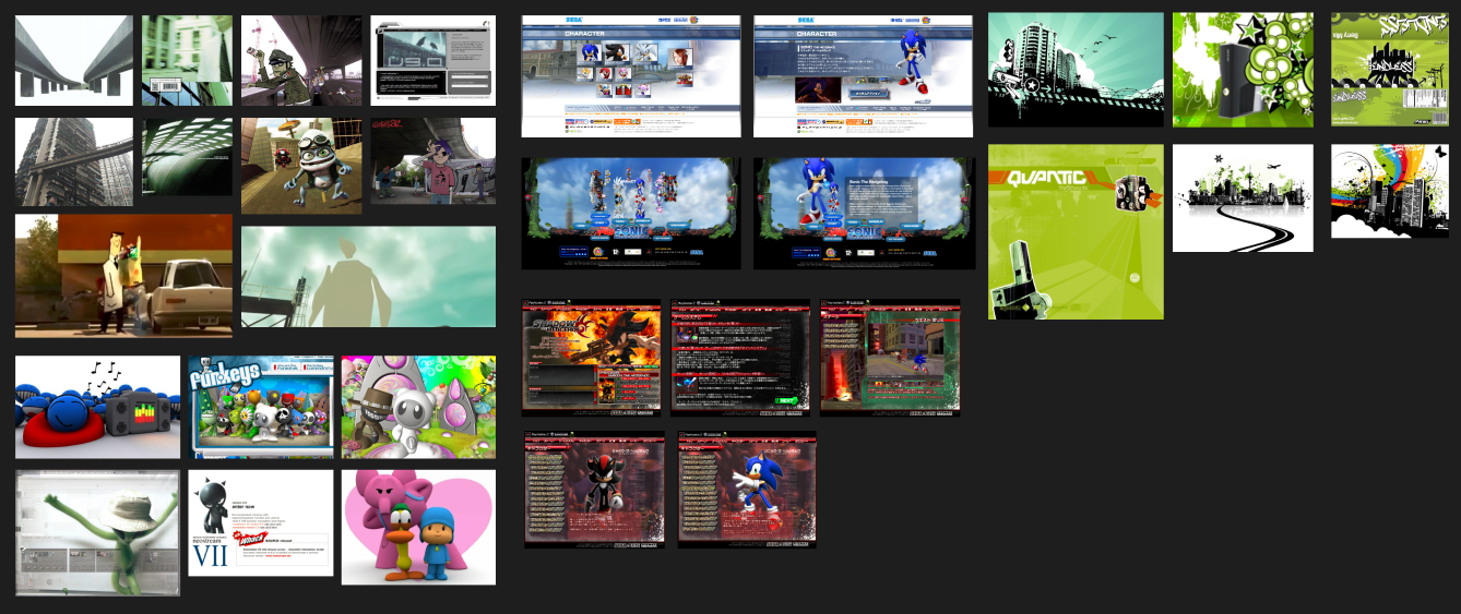
It was important that all promotional material, including the website, reflected the aesthetics of the 2000s. I began assembling images and looking through websites of the time using Pinterest, Web Design Museum and the WayBack Machine to get inspiration from designs that I felt matched the aesthetic direction of the project.
Everything was then compiled onto a moodboard in Figma to use as a reference while designing.
home page prototype
urban design
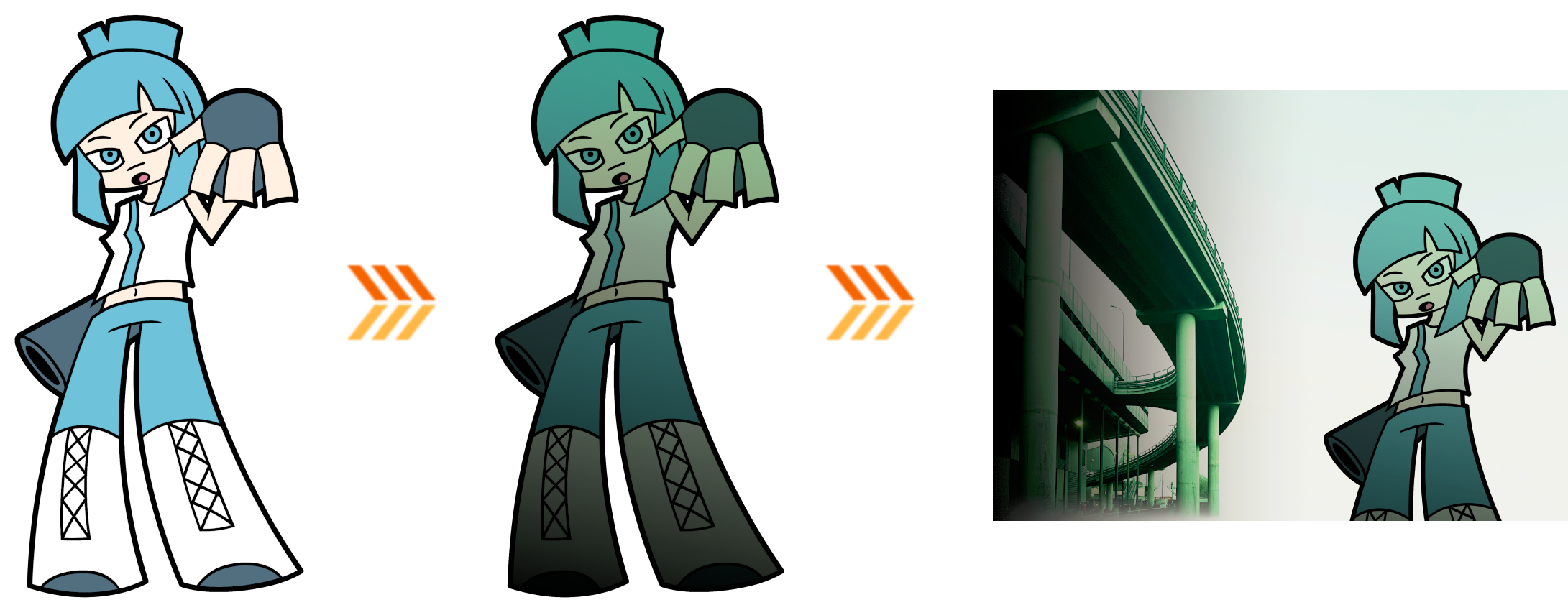
Instead of starting with a low-fidelity prototype and going up, I chose to make a high-fidelity mockup of the site's home page. Doing this would allow me to test different ideas based on the reference material I gathered.
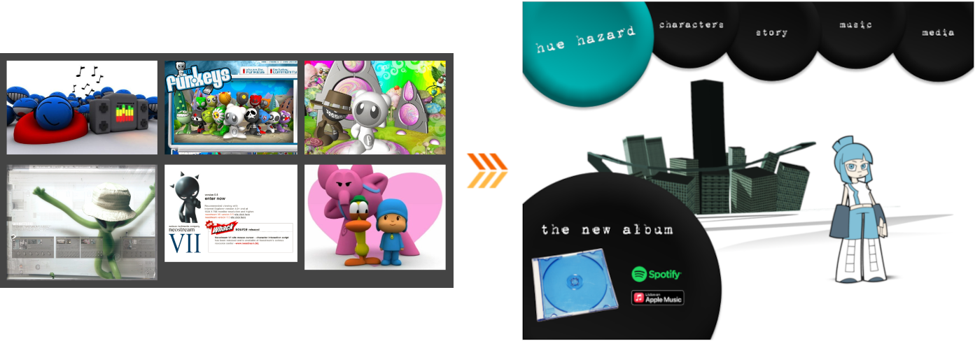
I wanted to give an urban feeling to the design, pulling inspiration from the band Gorillaz. The band's artwork, as well as many Cartoon Network Blips at the time had a habit of placing 2D characters in real-life, often urban environments. I loved this aesthetic very much as a kid, and thought it could be fun to try.
I edited a picture I took under a highway, removing the surrounding area to focus on the highway itself. I also tinted the highway a slight green color to bring out some ugliness, similar to the color grading in The Matrix.

mia
I took a drawing Mia, a character from Hue Hazard, and tinted her a similar green color. Doing this alongside applying a light gradient for lighting depth helps her blend into the background and feel like a part of the scene.
ui and layout
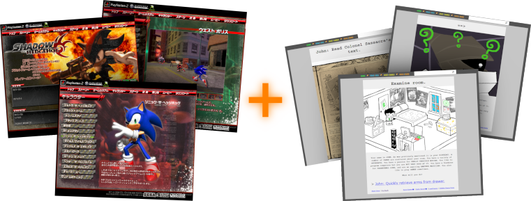
I based the general layout of my site the website the 2005 game Shadow the Hedgehog. While the goal of the site isn't to tell a narrative, it does contain various information about the narrative found in the game.
I sought to combine this with the layout of the web series Homestuck. I myself haven't read Homestuck, but its method of telling a story through HTML pages was very fascinating to me.
After tinkering around with various positions and ideas, I eventually settled on something I liked. I added a window to the left with links to stream the album with a placeholder image for the cover art. I made sure the window's opacity was lowered so the background could peak through.

feedback
One of my teachers liked the design, but said I should try breaking away from one singular design idea, as he could already see multiple possible aesthetics within the moodboard I made. He suggested I group the aesthetics into their own moodboards and make separate design ideas from them.
cartoony design
Following the feedback I received I made two more designs based on two different aesthetics I pulled from my moodboard.
This design pulls from more cartoony influences, rather than the real-life urban aesthetics. The navigation buttons were meant to resemble play-doh. In general I'm not much of a fan of this design, but it was still fun to make.
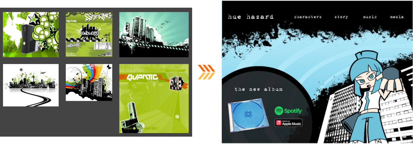
paint-splotch design
This design pulls from even more urban-metro like influences, but instead with a more flat minimalistic presentation. This one seemed to strike a balance between the real-life urban aesthetics, and something more cartoon-like.
feedback and validation
One of my design teachers said that while the designs mostly evoked 2000s aesthetics, I should also be aware of the distinction between making something that looks like the 2000s and making something that could've actually been designed in the 2000s.
With time, certain traits of a time period are more exaggerated than others, giving an inaccurate depiction of the actual aesthetics of the time. He did say that the final paint-splotch best resembled something that came from the 2000s, and that I should head in that direction.
ux feedback
I also took the designs to one of my UX teachers, who also preferred the paint-splotch design and said it looked like a music-related website. She said this was a good oppurtunity for user-testing as I could test the designs against snippets of the album to see which fit best.
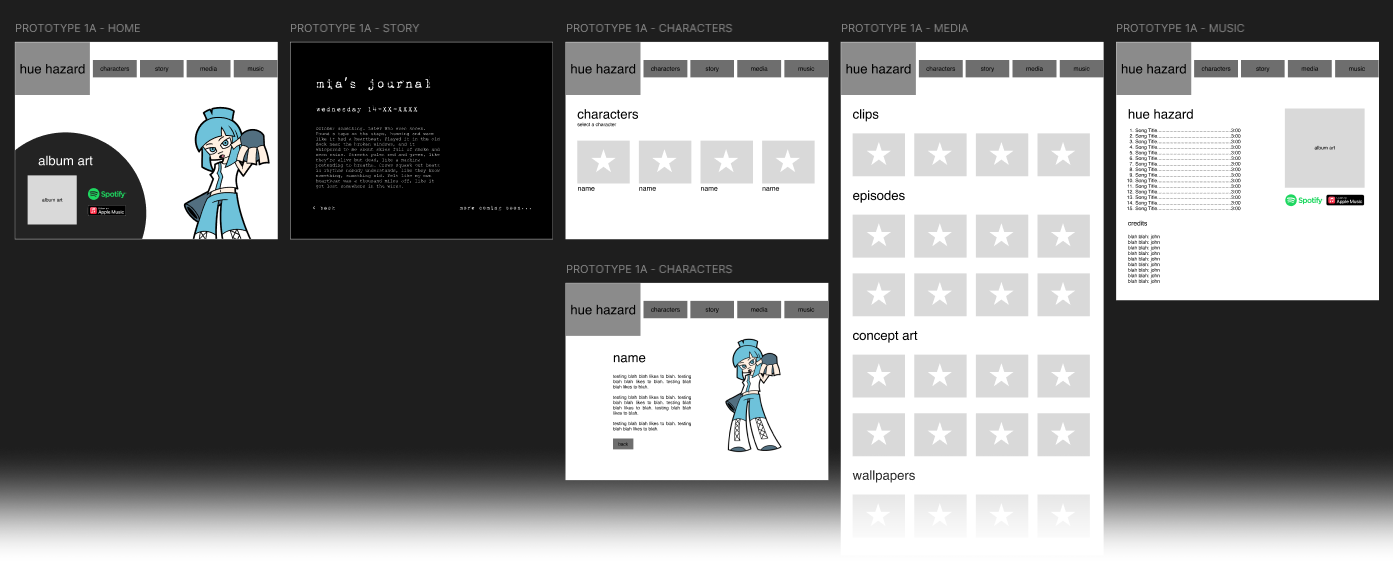
interactive prototype
site prototype
I used Figma to make a low-fidelity prototype of the final Hue Hazard site, with the goal of testing the sites layout. I tested 1 user, allowing them to browse the sight on their own. I made the following observations:
- The user went straight for any character and story related links before trying anything music related. This was due to the user knowing the music links wouldn't work, but they said later that they would've still checked everything else first.
- They suggested I made "story" the first button after the logo instead of "characters", as the story is the second most important thing on the site.
- They suggested I add a music player for users to preview the music.
user testing
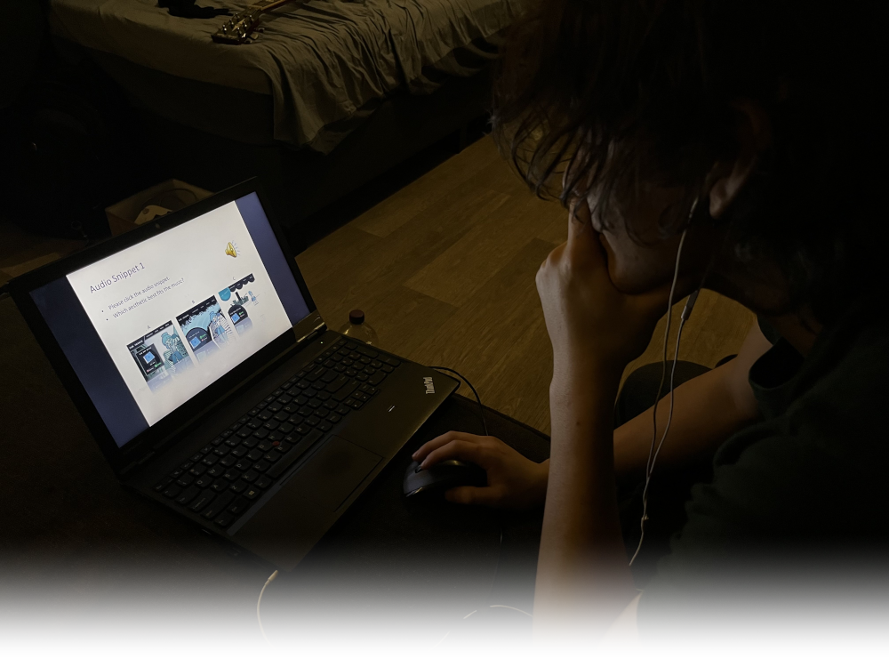
audio-visual test
I used Microsoft PowerPoint to test 3 users on which designs fit the album's music best, alongside a companion survey for each user to fill in.
This audio-visual test presents the user with four snippets of songs from album, letting them pick one of three mockup designs. At the end, they pick a design that they feel fit all the snippets best.
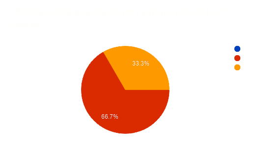
results
2 of the 3 the users found that the paint-splotch design fit best, and picked that design the most. This lines up with my teachers also picking that design, and so I feel I have enough validation to move forward with it.
reflection
In general I really liked working on this project, especially on the design side of things. The user tests I did gave me some great insight that I don't think I would've had otherwise. I do wish I got more feedback and some coding would've been fun to do, but time simply didn't allow for it.
In the end, working on this project was very beneficial to Hue Hazard, and I'm glad I chose to do it for Sprint X.